Companies are taking their businesses online and many private individuals are also doing businesses online. Online businesses have succeeded so much that alone in the US the Internet industry and business produced an economy of about $2.1 Trillions, and just so you don’t know how much this is then just to give you a hint its roughly 110 times more then the net worth of Jeff Bezos and its a lot. Online business are growing at a very accelerating pace and more people are getting involved day by day.
Since the users and providers(Websites, Stores and online Businesses) both are growing in such numbers the competition is also stretching. In Internet Economy there is a simple rule, more the visitors the more will be sale and to keep the sales up keep the customer coming and if you could follow these two simple rules then your business will grow at an unprecedented pace. An to attract more customers you need a very good service, products and a Good Website. Now when we say Good website, we often refer to the website which are attractive and don’t crash.
But that is not the whole ball game, with the ever-evolving industry such as Internet and E-commerce, if you ought to shine then you better keep up with the trend and change and just to make matters worse internet is always changing its trends. Not along ago E-Commerce was all Web and desktop based but now in the span of no more than 5 years it has taken a tremendous shift from being Desktop Web Based to mobile web based and its affecting to businesses especially to the ones who are immune to changing circumstances.
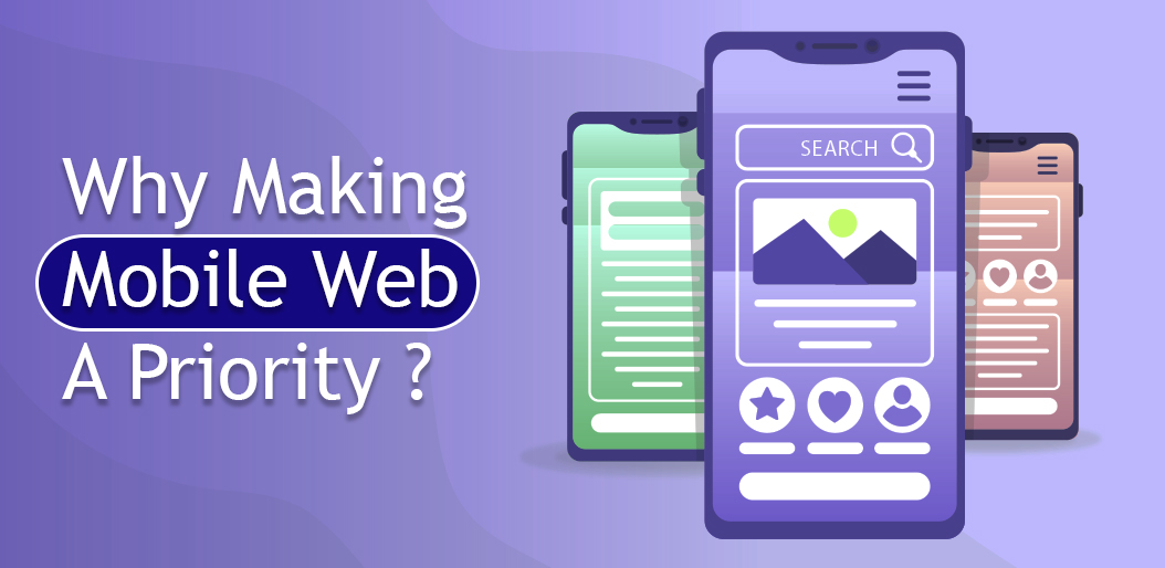
Responsive Websites
Unlike the first decade of 21st century there are many mobile users now and these users prefer to shop online using their mobiles. A rough estimation shows that there are currently approximately 2.7 Billion people on this planet who are smart phone users meaning that if you are using just Desktop based website then you are losing 2.7 Billion people without doing any harm to them. So, to keep in business and tackle these problems there are Responsive websites, generally explaining, the websites that can change their interference according to the devices they are being accessed. These types of websites are not designed specifically for either a desktop or mobile user because responsive websites have the ability to change into any interference based upon the device.
AMP & PWA
AMP or accelerated mobile pages are the tools of future, because mobile web pages takes too long to load and that a potential weak point for any business since slow loading pages tends to lose customers for good and many studies have suggested that a mobile user waits no more than 3 seconds for a mobile web page to load, and if the page fails to load then that customer will move on to any other website and he is unlikely to return, so keeping that in mind a mobile web page should load quickly hence AMP is very necessary for your E-commerce site if your ought to keep your customers.
After AMP brought you a client then its PWA which keeps the client on the web page and keeps them engaging. PWA stands for progressive web apps and their major purpose is to keep the customers engaging with the site by pushing notifications, pop ups or even allowing them viewing during offline mode.
Google Mobile-First Indexing
In past Google’s crawling and indexing algorithm have used the desktop version of web. Mobile-first indexing means that Googlebot will now use the mobile version of your website for crawling and indexing. This helps to improve the search experience for your mobile users. Keep in mind that you may see more traffic in your website logs from Googlebot Smartphone.
Optimize Image for Mobile View
Image optimization is one of the major challenge while working for mobile friendly website. We must serve proper scale of dimension for every image for mobile view of website to make it faster during low internet data speed. It’ll help you to retain more mobile user on first landing of the website. In now days, Google PageSpeed is more important for every website that’s why image optimization will also help to make Google PageSpeed score high. Not only Google PageSpeed but also other popular website speed and optimization tool such as GTMatrix will also notice this optimization while measure their score ranking.
Conclusion : These were just some methods of many to keep your clients and customers in your pocket and to attract new ones too. There are other methods and reasons too why should have a website that can be accessed from both desktop and Mobile. There are other factors that could enhance this in an opposite direction and one of the prominent one is the mobile applications, but lets be assure mobile apps don’t provide the same experience as the mobile web pages does so you better not spent your time and money on mobile apps while you can get better results through website. And an important thing to consider while providing a mobile web experience is to keep it as fast as possible.